WEB PHILOSOPHY
There are best practices to our Web Design that we strive to follow with every Web Page. These practices help with consistency and user experience. We believe we should always design for the user first.
SIMPLE
Simple is beautiful.
Simple websites are the way to go if you want people to feel welcome and invited to your organization. With the user first strategy, you want to go simple to allow people to want to be at your site.
- A simple website puts things right where they are supposed to be.
- A simple website keeps the flashy things to a minimum.
- A simple website has an appropriate amount of “white space”.

DESIGN
Design is vital. The design of a website should be functional first, attractive second, and have a nice flow to it third. First you want a functional website. All the links should work and be in their proper place. Next you want an attractive website. Images should be lined up with each other. Centered things should be in the center. There should be an appropriate amount of white space. The site should look good. Lastly the site should flow together. Pages should be consistent and images should be relevant and the correct size. Overall the design of a website is what will keep a visitor there and will bring them back later.

INTUITIVE NAVIGATION
Intiuitive Navigation is an absoute must. Websites should be easy to navigate. The navigation bar should be easily found and make sense to the average user. You shouldn't need a degree in HTML to figure out a website. If your navigation is not intuitive people will leave before they find out what your organization has to offer.

CONSISTENCY
Consistency is key. Your customers expect to have the same look and feel throughout the site. They don't want to have to figure each individual page out. Web viewers today want easily found navigation, logos, and contact information. It is important to keep your site consistent across all of its pages.

COMPATIBILITY
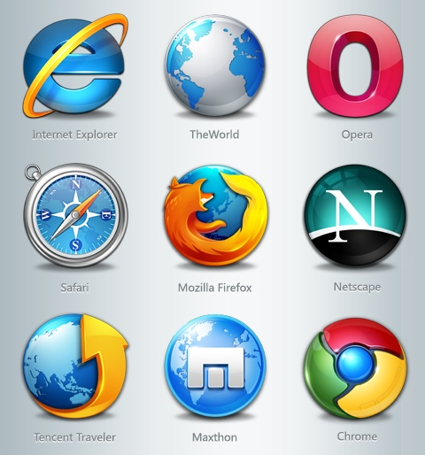
Multiple Browser Compatibility is important. In today's technological world there are many browsers the are used to view websites. You have windows browsers, Mac browsers, Android browsers, iPhone browsers, and more. Each browser can render a web page differently. Images or columns can be in different places based on which browser you use to view the website. That is why it is important to develop a website with many browsers in mind, checking with them frequently to make sure that your site looks the best it can on any browser.

RESPONSIVE DESIGN
Responsive Design is critical. It is all about making your website look right on all of your devices from your large screen computer monitor all the way to your small screen smart phone. Your website will change the way it looks so that it fits your screen size. Today most people that will be looking at your site will look at it from multiple devices. Your site should look good on all of them.


